UX DESIGN
Aggie Rewards
A UC Davis On-Campus Food Rewards App
FRAMER, ADOBE PHOTOSHOP, PROCREATE
OCT - NOV 2023
INTRODUCTION
INTRODUCTION
During a design sprint organized by a campus club, I along with 3 fellow designers developed an app called Aggie Rewards to incentivize students to dine on campus. The project aimed to address the decline in on-campus dining by providing a rewards-based incentive. Our design won the "Most Human-Centered Design" award.
During a design sprint organized by a campus club, I along with 3 fellow designers developed an app called Aggie Rewards to incentivize students to dine on campus. The project aimed to address the decline in on-campus dining by providing a rewards-based incentive. Our design won the "Most Human-Centered Design" award.
MY ROLE
MY ROLE
Together with my team, we split roles within researching recurring problems within on-campus dining, conducting out user interviews, analyzing collected data, and brainstorming innovative solutions to enhance the dining experience on campus.
Individually, in the design realm, I conceptualized different various layouts for the rewards page through exploring different design components, expanding user flows, and ensuring the experience was a blend of interactive and captivating
OVERVIEW
OVERVIEW
AggieRewards is designed as a mobile app accessed by UC Davis students and faculty to encourage more on-campus dining through an interactive rewards program.
The initial concept for AggieRewards was developed during a six-week design sprint hosted by Design Interactive at UC Davis. The prompt was to create a digital platform that rewards students for visiting their favorite on-campus spots. Our team of four designers, including myself, aimed to motivate students to choose on-campus dining over off-campus options. Once the event had closed, my team was awarded with the Most Human-Centered Design.
PROBLEM
Food is HORRIBLY Expensive
Food is HORRIBLY Expensive
With multiple food trucks and campus affiliated food spots, UC Davis offers a variety of enjoyable eateries. However, many students have been deterred from dining on campus due to high costs and a lack of incentives, leading to decreased revenue for campus dining services. (tell me why a bagel is $8.25 with no cream cheese, a CRIME)
With multiple food trucks and campus affiliated food spots, UC Davis offers a variety of enjoyable eateries. However, many students have been deterred from dining on campus due to high costs and a lack of incentives, leading to decreased revenue for campus dining services. (tell me why a bagel is $8.25 with no cream cheese, a CRIME)
SOLUTION
Rewards = Free = Motivation to Buy More Food
Rewards = Free = Motivation to Buy More Food
In order to have UC Davis students dine more frequently on campus, we developed a durable and accessible rewards program. Initially, my team considered a stamp card system, which later evolved into a points-based rewards program. We created a platform where students can view their accumulated points, schedule orders for meals and drinks, and see the distance to each eatery—all with a simple tap.
In order to have UC Davis students dine more frequently on campus, we developed a durable and accessible rewards program. Initially, my team considered a stamp card system, which later evolved into a points-based rewards program. We created a platform where students can view their accumulated points, schedule orders for meals and drinks, and see the distance to each eatery—all with a simple tap.
COMPETITIVE AUDIT + ANALYSIS
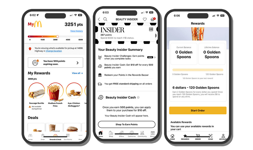
There is No "Easy Mode".
There is No "Easy Mode".
We noticed that most programs lacked an "easy mode" and had clunky navigation. They were either too wordy and overwhelming or visually unappealing. For example:
McDonald's app is user-friendly and offers frequent rewards but feels crowded with food items yelling at you.
Teaspoon, a local boba shop, gives you 2 points (Golden Spoons) for every dollar spent. When you reach 120 Golden Spoons ($60), you get a free drink. Not exactly a steal.
Sephora’s tiered loyalty program offers exclusive rewards, but you typically need to spend over $100 just to get a free face wash worth $10. Seems a bit steep, right?
USER RESEARCH
The People Want Easy and Cheap.
The People Want Easy and Cheap.
We surveyed students and found:
53% rarely dine on campus – a lot of students aren't using campus dining.
41% would dine on campus more if there were rewards – a solid potential for a rewards-based system.
Through our research, we found that a successful rewards program needs to be:
Accessible: Easy for all students to sign up and use.
Easy to Understand: Simple rules and clear rewards.
Desirable: Offering rewards that students genuinely want and feel are worth the effort.

THINK!
How Can We Incentivize UC Davis Students to Dine on Campus More Frequently and Make It More Affordable and Accessible?
How Can We Incentivize UC Davis Students to Dine on Campus More Frequently and Make It More Affordable and Accessible?
THINK!
How Can We Incentivize UC Davis Students to Dine on Campus More Frequently and Make It More Affordable and Accessible?
IDEATION
"Easy, Simple, Clean"
"Easy, Simple, Clean"
With four designers gathered around a laptop, we brainstormed ways to enhance the on-campus dining experience. We envisioned a digital stamp card that rewarded users for visiting selected spots on campus, similar to a scavenger hunt. Later, we considered a loyalty program that would reset every quarter. We tossed around multiple ideas, but none seemed to stick, as they often had issues, like how to determine the equivalency of items from different restaurants on the stamp card. Each designer was tasked to develop their own version of a rewards program, which was then put through User Testing to determine which design was most appealing to consumers.
With four designers gathered around a laptop, we brainstormed ways to enhance the on-campus dining experience. We envisioned a digital stamp card that rewarded users for visiting selected spots on campus, similar to a scavenger hunt. Later, we considered a loyalty program that would reset every quarter. We tossed around multiple ideas, but none seemed to stick, as they often had issues, like how to determine the equivalency of items from different restaurants on the stamp card. Each designer was tasked to develop their own version of a rewards program, which was then put through User Testing to determine which design was most appealing to consumers.
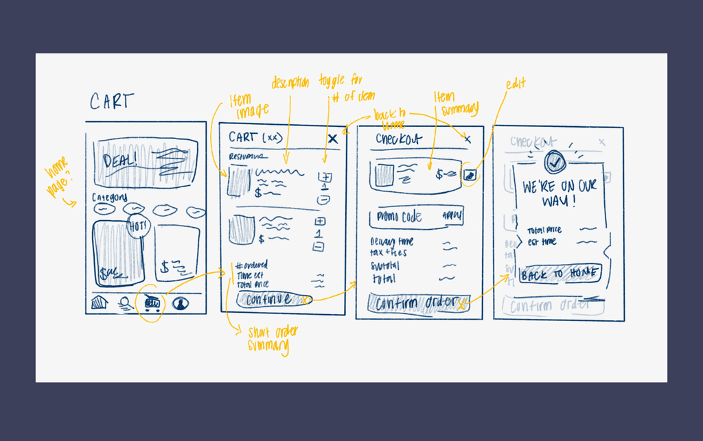
EARLY SKETCHES + USER FLOW
EARLY SKETCHES + USER FLOW
USER TESTING
A Cup of Coffee Please!
A Cup of Coffee Please!
We had our users complete two main tasks
① ACCESS REWARDS PAGE
② ORDER A CUP OF COFFEE
We had our users complete two main tasks
① ACCESS REWARDS PAGE
② ORDER A CUP OF COFFEE
During testing, users were unsure if certain elements were interactive or just decorative. On the positive side, they found the overall experience straightforward and easy to understand.
During testing, users were unsure if certain elements were interactive or just decorative. On the positive side, they found the overall experience straightforward and easy to understand.
ITERATIONS
A New Makeover
A New Makeover
Users found the app's flow confusing and visually unappealing. By incorporating UC Davis's official colors, we introduced a bolder, cleaner look compared to the old pastel palette.
Users found the app's flow confusing and visually unappealing. By incorporating UC Davis's official colors, we introduced a bolder, cleaner look compared to the old pastel palette.
Stamp Card Out! Points In!
Stamp Card Out! Points In!
Through User Testing, we scrapped the stamp card as it was less appealing and more confusing than a traditional point system. Feedback from users indicated that a regular point system was more effective than a stamp card, which was found messy and confusing. In order to still maintain the incentives for visiting certain dining spots on campus, a complementary system was implemented that provides a point multiplier for dining at select locations.
Through User Testing, we scrapped the stamp card as it was less appealing and more confusing than a traditional point system. Feedback from users indicated that a regular point system was more effective than a stamp card, which was found messy and confusing. In order to still maintain the incentives for visiting certain dining spots on campus, a complementary system was implemented that provides a point multiplier for dining at select locations.
LOW-FIDILITY PROTOTYPE
LOW-FIDILITY PROTOTYPE
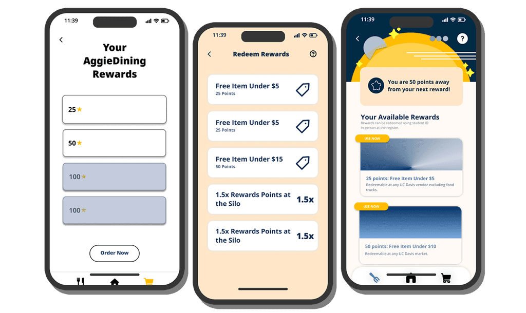
MID-FIDILITY PROTOTYPE
MID-FIDILITY PROTOTYPE
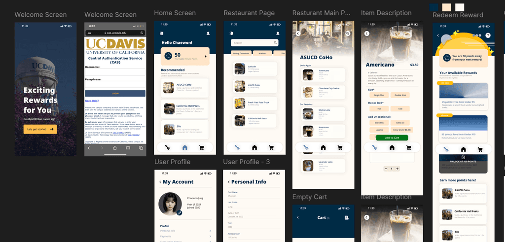
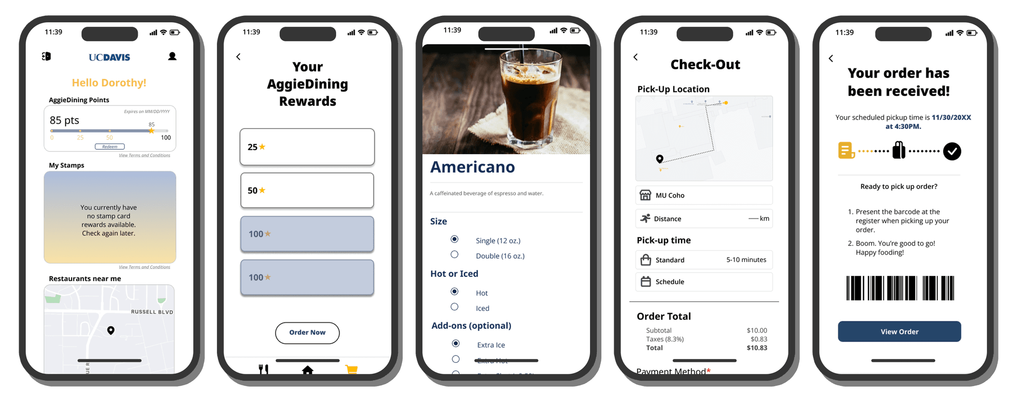
HI-FIDELITY PROTOTYPE
HI-FIDELITY PROTOTYPE
THE FINAL PRODUCT
Introducing: AggieRewards
Introducing: AggieRewards
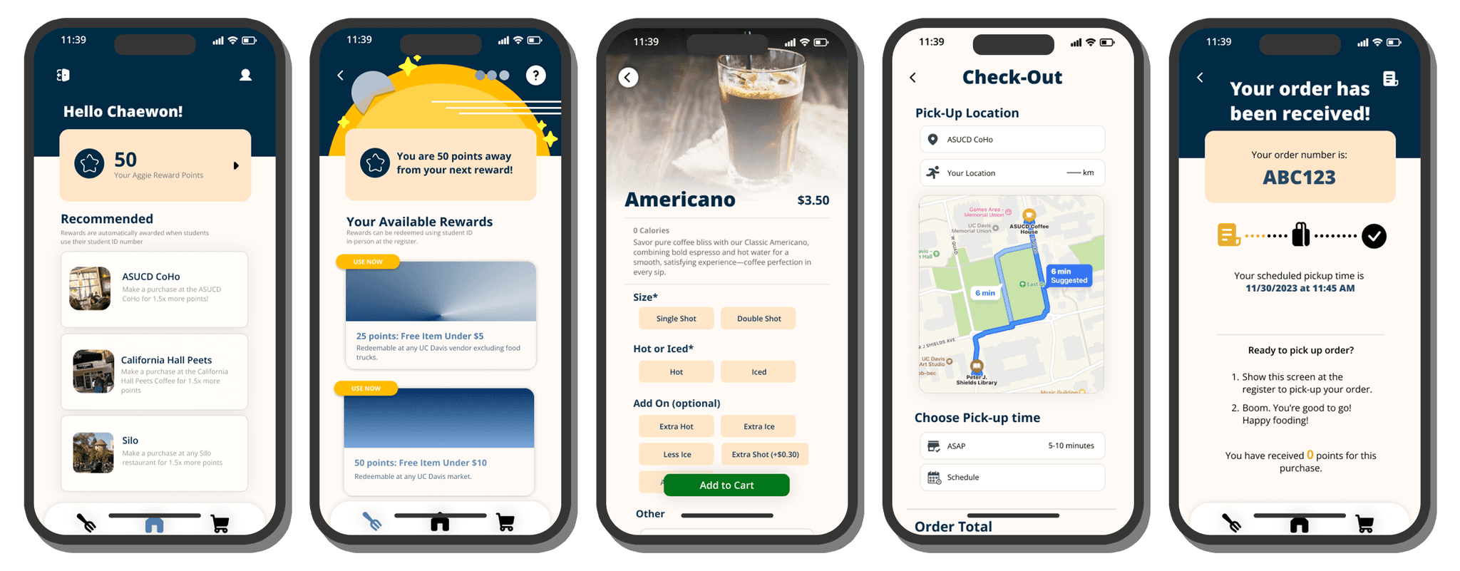
At first glance, AggieRewards takes students to the login page via the UC Davis Portal (CAS). After logging in, they land on the home page, where they see a banner displaying their earned points and a curated list of nearby campus dining spots sorted by distance from their current location.
As users explore the app, they can easily order meals for immediate pickup or schedule them for later. Tapping the points banner directs them to a visually appealing rewards page where certain rewards are unlocked only after earning a specified number of points. To redeem rewards, users tap the "Use Now" icon, which automatically applies the discount to their current cart. The checkout process is straightforward, guiding users through selecting sizes, meal adjustments, and finalizing their order.
AggieRewards uses the official UC Davis color palette, creating a welcoming, clean, and professional look. The colors provide a calming effect, making it easy for users to navigate and discover the best dining spots on campus.
AGGIE REWARDS FINAL PRODUCT
AGGIE REWARDS FINAL PRODUCT
WRAPUP
Challenges???
Challenges???
When developing this platform, we frequently bounced back and forth whether to use a stamp card system or switch to a traditional point system for better user experience and design. One major challenge was addressing varying technical skill levels, as some users found the original design user-friendly while others found it confusing. This highlighted the need for a highly intuitive interface. We also had to find a balance between simplicity and functionality—ensuring the system was engaging yet practical, without being overly simplistic or too complex.
When developing this platform, we frequently bounced back and forth whether to use a stamp card system or switch to a traditional point system for better user experience and design. One major challenge was addressing varying technical skill levels, as some users found the original design user-friendly while others found it confusing. This highlighted the need for a highly intuitive interface. We also had to find a balance between simplicity and functionality—ensuring the system was engaging yet practical, without being overly simplistic or too complex.
Takeaways and What's Next
Takeaways and What's Next
As my first take into the UX Design world, I found this project to be highly impactful, building me a strong foundation into this field. For what's to come next, I hope to utilize what I have learned from this project to carry onto various more projects to come. Currently, I am working on a startup with a group of colleagues where we will solely focus on enhancing the user's experience within food sharing on the social web.
As my first take into the UX Design world, I found this project to be highly impactful, building me a strong foundation into this field. For what's to come next, I hope to utilize what I have learned from this project to carry onto various more projects to come. Currently, I am working on a startup with a group of colleagues where we will solely focus on enhancing the user's experience within food sharing on the social web.
bay area,
califonia
made with bread & butter
© 2026
bay area,
califonia
© 2026
bay area,
califonia
© 2026