UX DESIGN
FEED
A UC Davis On-Campus Food Rewards App
FRAMER, ADOBE PHOTOSHOP, PROCREATE
DEC 2023 - MARCH 2024
INTRODUCTION
Endless hours of scrolling through Instagram and TikTok for late night mukbangs got me and a few friends thinking: how can we elevate this experience. That's when we came up with the idea to create a space where not only could you doom scroll your way into food heaven, but also help you discover new recipes and explore diverse flavors.
MY ROLE
With a group of 4 designers, we brainstormed and created design frames, aiming to break away from the conventional social media formats like Instagram and TikTok. Our goal was to craft a fresh discovery experience with its own unique twist.
Individually, I focused on conceptualizing various layouts for the explore page. Different design elements found their way into my frames, expanding user flows, and ensuring the experience was a equal blend of both interactive and captivating.
OVERVIEW
Feed was created over an empty stomach during my finals week during my first year of college. Coming into a new town, fresh out of San Jose, I found myself constantly pondering the big question of "What shall I eat today?". As a big foodie lover, I often would browse through Yelp to find "The Spot" to bring my friends and family to go out and eat. At times, I would also find myself going through my Pinterest, searching for new recipes or photos of meals to inspire me to chef something up.
With Feed, my team and I were able to design a platform that added an innovative take on the food discovery journey, it also gives a chance for a community of foodies as myself to grow and chef it up.
PROBLEM
Where to Eat? Affordable? Yummy?
SOLUTION
A Fresh New Look
We came up with an idea to incorporate both user friendly approaches to food discovery which was a similar blend to Yelp and Pinterest. By keeping similar and familiar UI, it allows for users to easily navigate their way through the app.
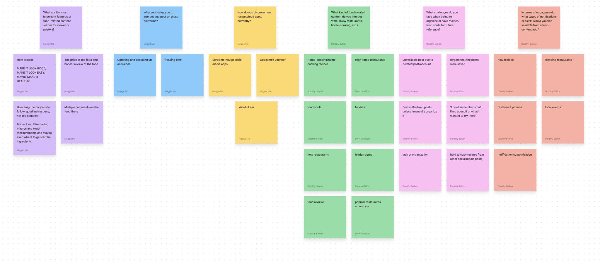
USER RESEARCH
People Want An Interactive and Fun Place to Discover Food
We began asking participants questions regarding their social media usages and what draws them most. From this, we found that majority of the people we interviewed want:
To find newer places to eat or try different kinds of foods
Have a personal digital diary of the food adventures they partake
Be able to find restaurants or good eats in close proximity
With that, we also researched about some threats and weaknesses our idea may falter in:
Bad reviews towards certain restaurants
Bias reviews / posts due to an individuals experience within eating cultural foods based on that one experience
EARLY SKETCHES + USER FLOW
THINK!
How might we blend the elements of interactive and innovation to forge a journey in the world of food discovery?
IDEATION
Make Food Fun.
I began to "idea vomit" and came up with multiple ideas within the branding of Feed and how the app could potentially be functioned and used. Coming from a passion for cooking and love for exploring newer tasting palettes, I wanted to emphasize the importance of building a community on this platform. Sharing recipes, meeting new friends, and just connecting together through our love for food is what this app is all about.
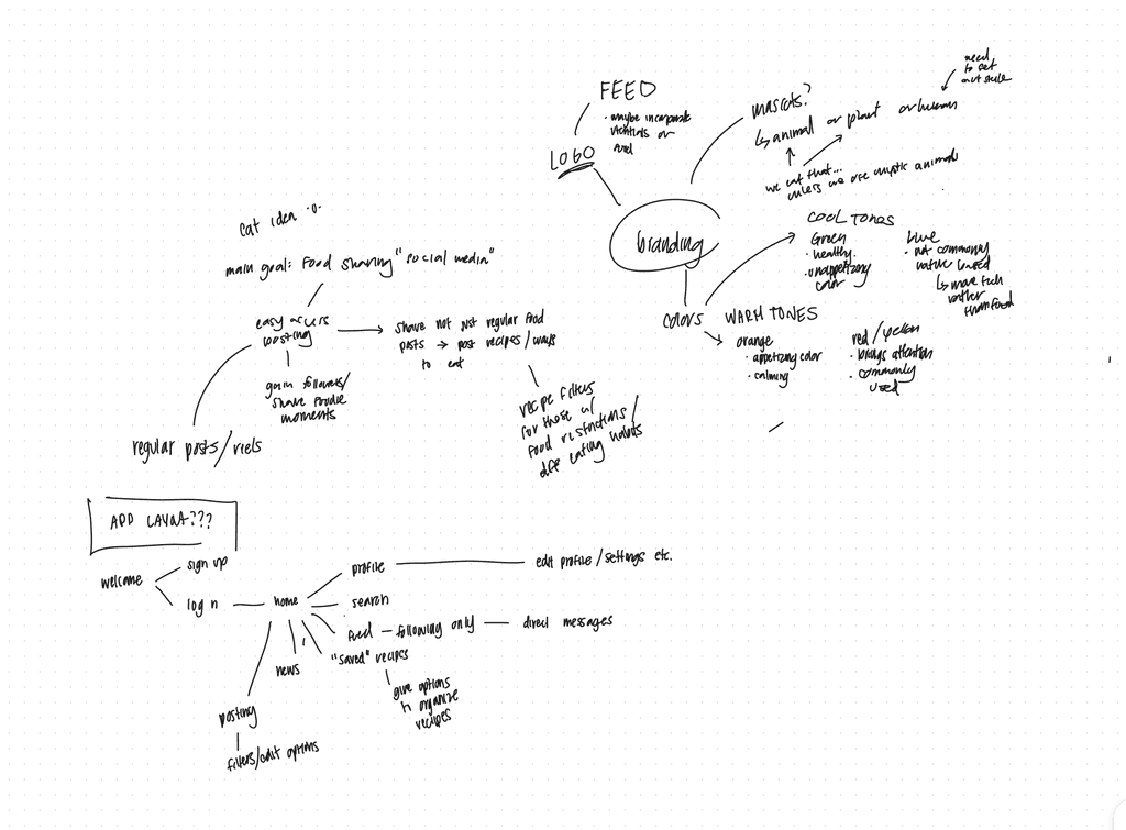
IDEA MAP
PROTYPING
Ideas, Ideas, Ideas, and More Ideas.
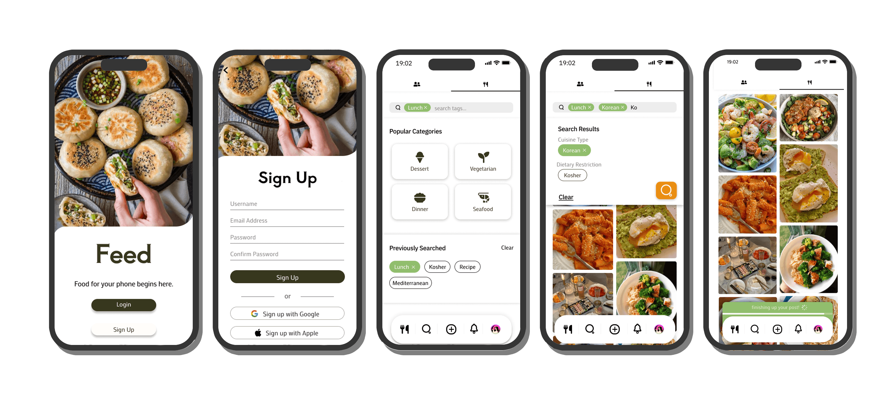
The three of us designers gathered together to share our sketches and mockups, and soon we combined them into a unified design. We realized we wanted to create a visually welcoming atmosphere for users entering the app, so we began comparing it to other photo-sharing social media platforms. Our initial prototype felt like a mix between Pinterest and TikTok, so we explored different layout options. One feature, the filtering function, remained consistent through each phase as we all agreed it was essential for helping food enthusiasts easily search for specific foods or meet their dietary needs.
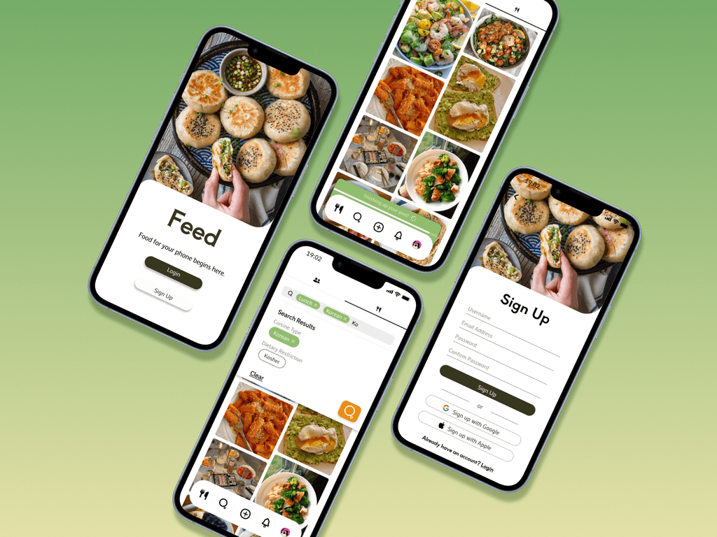
LO-FIDELITY PROTOTYPE
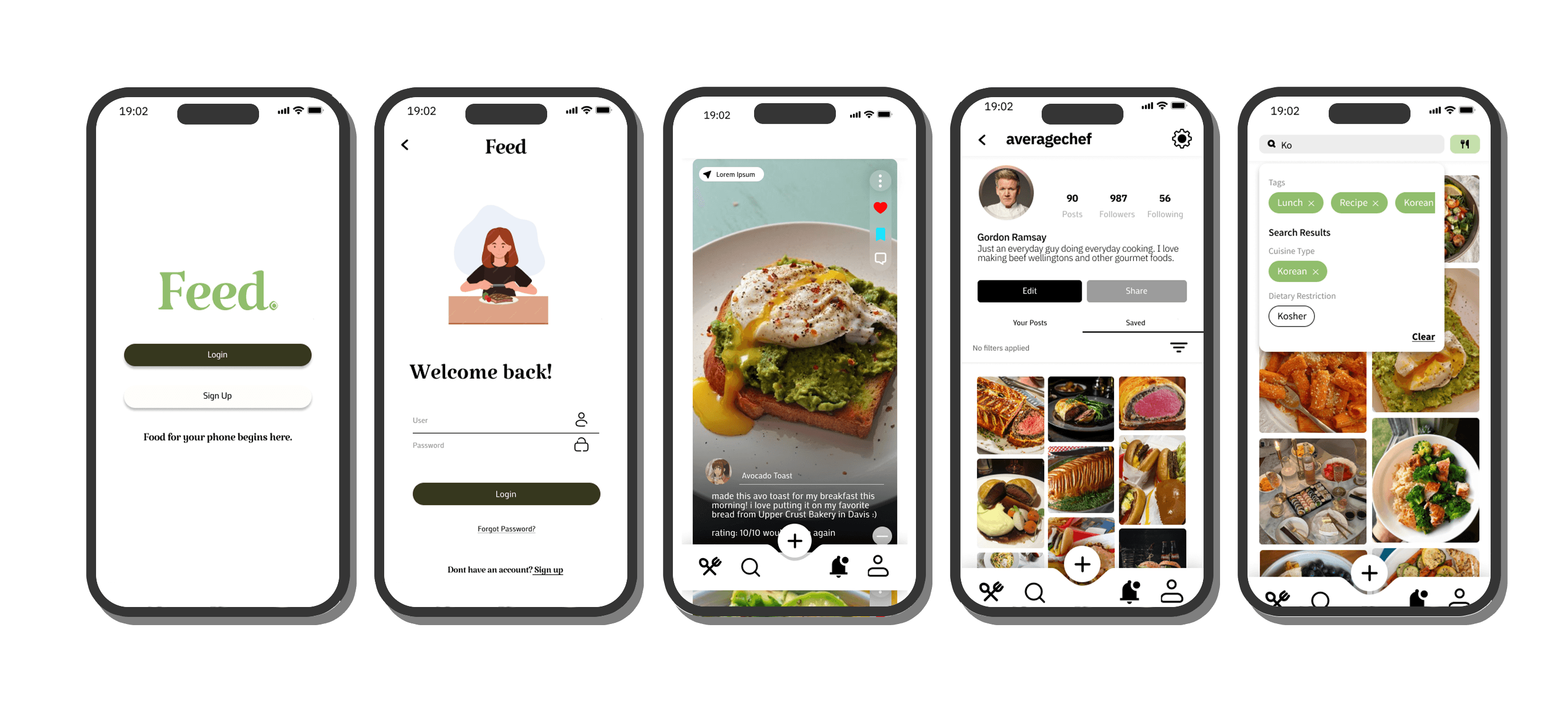
MID-FIDELITY PROTOTYPE
WHAT'S NEXT?
…
Feed started off as a passion project designed by four foodies and tech bros. We do hope to come back to this project sometime in the near future but in the meantime, we're still in the brainstorming phase, working on how to craft a unique and welcoming layout for the app. When all prototypes are finalized, we'll move on to user testing and gather more research. Stay tuned!